Why Hallways Feel Cramped
Most hallways are narrow, windowless, and treated as leftover space — a corridor you pass through, not a room you design. The result is predictable: dim light, blank walls, clutter creeping along the edges, and a space that feels smaller than it actually is. But a hallway is also one of the highest-traffic areas in a home, which means small improvements there pay off every single day. You do not need to widen the walls to make the space feel wider. You need to change what the eye sees.
The eye reads a hallway in a straight line, from one end to the other, so the far wall matters more than anything else. A blank wall at the end of a dark corridor acts like a visual stop sign — it tells the eye the journey is over, and the space compresses. Anything that gives the eye something to look at along the way, or something pleasant to arrive at, stretches the perceived distance. Every tip below works on that one principle: give the eye somewhere to go.
Before changing anything, take a photo of the hallway from each end in normal daylight. Photos flatten perspective and expose problems the eye has learned to ignore — the dark corner, the mismatched frames, the runner rug that stops two feet short. Design decisions made from the photo are almost always better than decisions made while standing in the space, because the camera shows you what a visitor actually sees.
Light It Like a Room, Not a Tunnel
Lighting is the single biggest factor in how big a hallway feels. A single dim ceiling fixture in the middle of a long corridor creates a bright spot surrounded by shadows at both ends — the classic tunnel effect. The fix is to distribute light along the full length. If the hallway has two or more fixtures, replace every bulb with the same warm-white LED (2700K to 3000K) so the color matches end to end; mismatched color temperatures make a space feel patched together.
Brightness matters more than fixtures. Hallway lighting is one of the few places where going brighter than you think is the right call — aim for the equivalent of a 60 to 75-watt bulb per fixture, and if the ceiling fixture uses a frosted dome that eats light, consider swapping the shade for something more open. In a hallway with no ceiling fixtures at all, plug-in wall sconces with a warm bulb, placed at intervals along one wall, do the same job without any wiring.
Light color on the walls multiplies the effect. Dark or saturated paint in a windowless hallway absorbs the light you just added; pale, warm-neutral paint bounces it back. You do not have to go stark white — soft warm greys, pale creams, and muted sage greens all reflect well while feeling intentional. If the hallway connects rooms painted in stronger colors, the pale hallway actually helps: it becomes a visual breather between bolder spaces, which makes the whole home feel calmer.
Mirrors and the Rules for Using Them
A mirror roughly doubles the visual width of a hallway by reflecting the opposite wall, and it bounces light into corners that fixtures miss. One well-placed mirror does more than a gallery of small ones — a single large mirror, at least two-thirds the width of the wall section it hangs on, reads as a window. Several small mirrors scattered along the wall read as clutter.
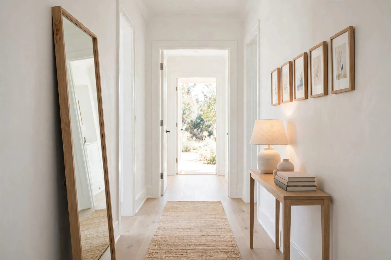
Placement rules are simple. Hang the mirror where it reflects something worth seeing: a window at the end of the hall, a piece of art, or the open doorway of a bright room. Never hang it where it reflects a blank wall or a light switch — a mirror that shows nothing interesting just shows the hallway's flaws twice. In a narrow hallway, a full-length leaner mirror propped at a slight angle against the wall is often easier than hanging, and the slight tilt catches more light from above.
The far wall deserves special attention. Hanging a mirror on the wall at the end of the hallway reflects the entire corridor back at you, which visually extends the space by its own length. If a mirror on the end wall feels too much, a piece of art with depth — a landscape, a photograph with a strong vanishing point — gives the eye the same sense of distance without the reflection.

Furniture That Fits the Corridor
Hallways rarely have room for real furniture, but a single slim piece changes the space from a passage to a place. The rule is clearance: keep at least 36 inches of walkway clear, which means in a 48-inch-wide hallway, your console table can be no more than 10 to 12 inches deep. Measure the hallway before shopping — most console tables are 14 to 16 inches deep, which sounds small until it eats a third of your walkway.
What goes on the table matters more than the table itself. One lamp with a warm bulb adds the layered light the hallway needs. A small stack of books or a lidded box gives the surface a purpose. A single vase or bowl is enough decoration — two or three objects per surface is the maximum before a narrow hallway starts feeling crowded. Leave breathing room around each object; in a small space, empty surface reads as calm, not unfinished.
If even a slim table will not fit, the walls can carry the function. A row of hooks at a consistent height holds bags, coats, or a leash without eating floor space. A narrow floating shelf — six inches deep — holds keys, mail, and a small plant in the space a table would have used. Wall-mounted pieces keep the floor visually clear, and a clear floor is half of what makes a hallway feel wide.
Paint, Trim, and Ceiling Strategy
The hallway's paint job carries more visual weight than in any other room, because the walls are all you see. The ceiling deserves the same paint as the walls — or the exact same color in a flat finish — rather than the default bright white. A white ceiling in a narrow hallway creates a hard horizontal line where wall meets ceiling, and that line emphasizes how close the walls are. Painting the ceiling the wall color erases the boundary and lets the eye travel upward, which reads as height.
Trim is the hallway's secret weapon. Painting the baseboards, door frames, and any wainscoting the same color as the walls — a technique designers call color drenching — removes every visual interruption along the corridor. Each white door frame in a colored hallway is a full stop for the eye; each matching one is a comma. If color drenching feels like too much, the reverse works nearly as well: keep walls pale and paint the trim one shade darker in the same color family, which adds definition without adding stops.
Doors are worth a decision, not an afterthought. Interior doors in a hallway multiply — three or four doors along a short corridor is normal — so their color sets the rhythm of the whole space. Doors painted to match the trim keep the rhythm quiet; doors in a contrasting color turn each one into an event. Neither is wrong, but mixing — two white doors, one wood, one painted — always looks accidental. Pick one treatment and apply it to every door the hallway touches, including closet doors.
One practical note: hallways take abuse. Walls get scuffed by bags, vacuum cleaners, and moving furniture, so use a satin or eggshell finish rather than flat paint — flat shows every touch-up as a patch, while satin wipes clean and touches up invisibly. The slight extra sheen also reflects a bit more light, which in a windowless hallway is free brightness.
Rugs, Art, and the Finish Line
A runner rug does two jobs at once: it adds color and texture to the largest visible surface, and its long lines pull the eye toward the far end, stretching the perceived length. The most common mistake is buying too short. A runner should span most of the hallway's length, stopping about six inches from each end — a rug that floats in the middle with bare floor on both sides chops the space into pieces instead of unifying it.
For art, think in a single horizontal line rather than a scattered cluster. Frames hung with their centers at the same height — about 57 inches from the floor, the standard gallery height — create a clean rhythm that the eye follows effortlessly. Matching or coordinating frames matter more than matching art; a row of prints in identical simple frames looks deliberate even when the images inside are completely different.
Finish with the far wall, because it is the first thing you see from the doorway and the last thing before you turn the corner. One strong piece — a large print, a mirror, or even a painted accent section — turns the end of the hallway into a destination instead of a dead end. When the far wall has something to look at, the whole corridor reads as a designed space rather than the gap between two rooms. That is the entire trick: a hallway that gives the eye somewhere to arrive feels like a room, and rooms feel bigger than tunnels.
